
Creating Content
D is for Design
If copy is the heart of your content, design is the face that gets you noticed.
3 minute read

If copy is the heart of your content, design is the face that gets you noticed across a crowded room.
And trust us, in the digital dating game of content marketing, you want to be more “swipe right” than “hard pass.”
Design isn’t just about making things look pretty (though we’re not complaining when they do).
It’s about creating an experience that guides your audience through your words like a charming Scottish tour guide – pointing out the important bits, giving them space to take it all in, and making sure they don’t wander off halfway through.
Why Your Words Need a Worthy Wardrobe
Let’s be real: even the most brilliant copy can fall flat when it’s dressed poorly.
It’s like sending Shakespeare to a job interview in pyjamas – the content might be genius, but no one’s sticking around long enough to notice.
Good design:
- Makes your content more digestible than a post-pub snack
- Guides the eye to what matters most
- Creates an emotional response before a single word is read
- Shows you care enough to make the experience enjoyable
Shocking statistic alert: People form visual impressions in just 50 milliseconds. That’s faster than you can say “tartan.”
Design Elements That Make Your Copy Pop
Whitespace: The Breath Between Words
Cramming your content together is like talking without pausing for breath – eventually, people will back away slowly.
Whitespace gives your words room to breathe and your readers’ eyes a chance to rest.
Too little whitespace and your content looks like an overwhelming wall of text (and we all know what happens to walls eventually – they get torn down or graffitied with rude drawings).
Typography: Choose Fonts That Don’t Make Eyes Bleed
Your font choices say a lot about you.
Comic Sans says “I might still use a Hotmail account.”
Tiny 8pt text says “I don’t actually want anyone over 25 to read this.”
For body text, aim for something readable that doesn’t scream for attention. Save the fancy fonts for headlines – like wearing statement jewellery, a little goes a long way.
Colour: Not Just Pretty, Strategic
Colours aren’t just decorative – they’re emotional triggers.
Blue creates trust (hello, every bank ever).
Red creates urgency (hello, every SALE sign ever).
Yellow grabs attention (hello, every warning sign ever).
Choose colours that:
- Reflect your brand personality
- Create enough contrast to be readable
- Don’t make your content look like a rainbow threw up
Images: Worth 1,000 Words (Choose Wisely)
Stock photos of people in suits shaking hands? Yawn.
Look for images that:
- Actually relate to your content (revolutionary concept, we know)
- Feel authentic rather than staged
- Add context or emotion your words might miss
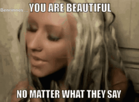
Or better yet, appeal to your inner millennial and use a GIF.

Mobile Matters More Than You Think
If your design doesn’t work on mobile, it doesn’t work. Full stop. End of story. Fin.
With over 60% of web traffic coming from mobile devices, designing for the small screen isn’t optional – it’s survival.

Word to the wise
Great design doesn’t compete with your copy – it complements it. It’s the perfect partnership, like whisky and a good story.
Remember: beautiful design without substance is just pretty packaging around an empty box. But powerful copy wrapped in thoughtful design? That’s the kind of gift your audience will keep unwrapping.
Need help making your content look as good as it sounds? Great Scot! blends compelling copy with eye-catching design to create content that commands attention.
Let’s make something great together. Contact us at [email protected]
More posts

C is for Clarity
Let’s be crystal clear about something: you should be crystal clear about everything.


A is for Audience
Kicking off our ‘A-Z of GREAT! Content’ series at the very beginning (we hear it’s…